The Card composable is a surface that can be used to present content and actions focused on a single topic.
Card를 display하는데 사용할 수 있는 single composable function이 아래와 같이 있습니다.
@Composable
fun Card(
    modifier: Modifier = Modifier,
    shape: Shape = MaterialTheme.shapes.medium,
    backgroundColor: Color = MaterialTheme.colors.surface,
    contentColor: Color = contentColorFor(backgroundColor),
    border: BorderStroke? = null,
    elevation: Dp = 1.dp,
    content: @Composable () -> Unit
)
아래에 Card 함수에 전달할 수 있는 가능한 properties가 있습니다.
- modifier: the modifier(s) to be applied to the Card
- shape: the shape to be used when drawing the card
- backgroundColor: the color to be used for the background of the card
- contentColor: the color to be used for the content of the card
- border: the border to be applied to the card
- elevation: the elevation to be applied to the card
- content: the composable to be displayed as the content of the card
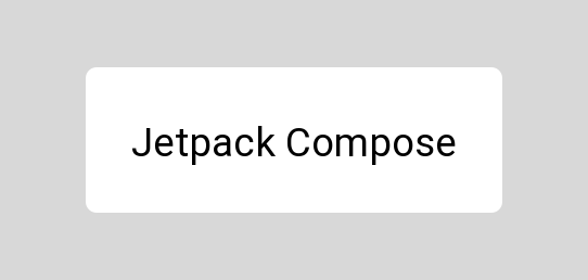
DISPLAY A CARD
Card composable을 출력할 때 최소한의 필수 인수와 함께 제공된 composable 함수를 사용하여 이를 수행할 수 있습니다.
Card에는 content 인수가 필수적으로 필요합니다. 이 인수는 Card의 본문으로 사용됩니다.
여기에서는 Text가 content argument(인수)라고 볼 수 있습니다.
Card {
    Text(
        text = "Jetpack Compose"
    )
}
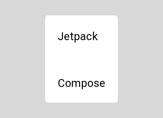
Because the Card only takes a single composable for the content argument, when displaying multiple children we will need to provide a layout composable for the content, which will in turn contain the collection of children that we want to display.
Card {
    Column {
        Text(
            text = "Jetpack"
        )
        Spacer(modifier = Modifier.preferredHeight(8.dp))
        Text(
            text = "Compose"
        )
    }
}
Card안에 Column으로 시작하면 아래와 같이 vertical로 Text가 display됩니다.
첫번 째 Text "Jetpack"과 Spacer로 8.dp정도 공간을 두고 또 다른 Text "Compose"를 생성합니다.
STYLING THE CARD
Card를 구성한 후에는 애플리케이션 테마에서 제공하는 기본값을 재정의하기 위해 몇 가지 스타일을 적용하려는 경우가 있을 수 있습니다.
이러한 경우 Card 구성 요소는 모양과 느낌을 제어하는 데 사용할 수 있는 몇 가지 인수를 제공합니다.
Setting the shape
모양 인수(shape = )를 사용하고 Shape reference를 제공하여 Card에 사용할 모양을 설정할 수 있습니다.
제공하지 않으면 기본적으로 애플리케이션 테마의 medium shape가 됩니다.
Card(
    shape = RoundedCornerShape(3.dp)
) {
    Text(
        text = "Jetpack Compose",
        modifier = Modifier.padding(16.dp)
    )
}
Setting the background color
backgroundColor 인수를 사용하고 Color reference를 제공하여 카드 배경에 사용할 색상을 설정할 수 있습니다.
제공하지 않으면 기본적으로 어플리케이션 테마의 표면 색상이 적용됩니다.
Card(
    backgroundColor = Color.LightGray
) {
    Text(
        text = "Jetpack Compose",
        modifier = Modifier.padding(16.dp)
    )
}
Setting the content color
contentColor 인수를 사용하고 Color refernece를 제공하여 카드 배경에 사용할 색상을 설정할 수 있습니다.
제공하지 않으면 기본적으로 카드의 배경색에서 계산된 색상이 됩니다.
Card(
    contentColor = Color.Black
) {
    Text(
        text = "Jetpack Compose",
        modifier = Modifier.padding(16.dp)
    )
}
Adding a border
border 인수를 제공하고 dp값을 제공하여 카드에 테두리를 추가할 수 있습니다.
제공하지 않으면 기본값이 null이 되고 카드에 테두리가 적용되지 않습니다.
Card(
    border = BorderStroke(2.dp, Color.Black)
) {
    Text(
        text = "Jetpack Compose",
        modifier = Modifier.padding(16.dp)
    )
}
Applying elevation to the card
elevation을 사용하고 BorderStroke reference를 제공하여 카드에 elevation을 적용할 수 있습니다.
제공하지 않으면 기본값은 1dp 입니다.
Card(
    elevation = 12.dp
) {
    Text(
        text = "Jetpack Compose",
        modifier = Modifier.padding(16.dp)
    )
}
https://joebirch.co/android/exploring-jetpack-compose-card/
'Android > Jetpack Compose Concepts' 카테고리의 다른 글
| JETPACK COMPOSE: OutlinedTextField, FilledTextField에 대해 알아보자 (0) | 2022.01.26 |
|---|---|
| JETPACK COMPOSE: Border에 대해 알아보자 (0) | 2022.01.23 |
| JETPACK COMPOSE: Jetpack Alpha for Glance Widgets (0) | 2022.01.21 |
| JETPACK COMPOSE: Column에 대해 알아보자 (0) | 2022.01.13 |
| JETPACK COMPOSE: Box에 대해 알아보자 (0) | 2022.01.11 |


댓글