Text Field는 사용자가 일반적으로 양식에서 텍스트 정보를 UI에 입력할 수 있도록 하는 UI 구성요소입니다.
material design의 Text Field에는 Filled text fields와 Outlined text fileds의 두 가지 유형이 있습니다.
둘 다 동일한 기능을 제공하므로 선호하는 스타일에 따라 선택해야 합니다.
혼합하는 것은 권장하지 않습니다.
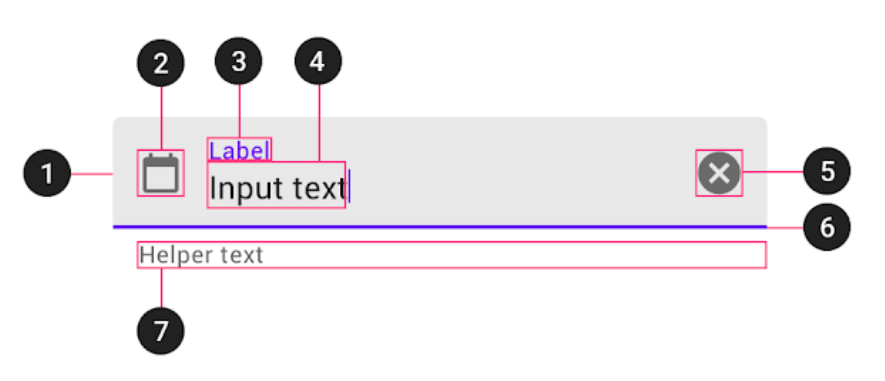
두 text field 유형 모두 컨테이너(1), 선택적 선행 아이콘(2), 레이블(3), 입력 텍스트(4), 선택적 후행 아이콘(5), 활성화 표시기(6) 및 선택적 도우미 텍스트(7)로 구성됩니다.
Outlined text field in Jetpack Compose
Compose는 외곽선 텍스트 필드의 Material 사양을 충족하기 위해 구성 가능한 OutlinedTextField를 제공합니다.
추가 사용자 정의 없이 OutlinedTextField composable은 다음과 같습니다.
이 컴포저블에는 약 20개의 매개변수가 있지만 그중 2개만 필수입니다.
Surface(color = MaterialTheme.colors.background) {
    OutlinedTextField(value = "Hello text field",
        onValueChange = { "abc" })
}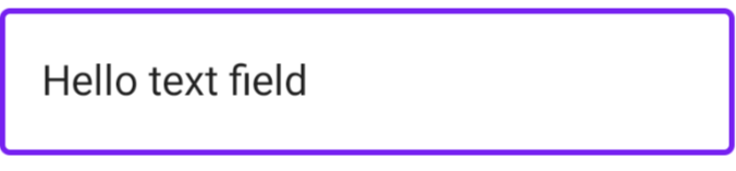
- value - 텍스트 필드에 표시된 텍스트
- onValueChange - 입력 서비스가 콜백의 매개변수로 오는 텍스트를 업데이트할 때 트리거되는 콜백
@Composable
fun OutlinedTextField(
    value: String,
    onValueChange: (String) -> Unit,
    modifier: Modifier = Modifier,
    enabled: Boolean = true,
    readOnly: Boolean = false,
    textStyle: TextStyle = LocalTextStyle.current,
    label: @Composable (() -> Unit)? = null,
    placeholder: @Composable (() -> Unit)? = null,
    leadingIcon: @Composable (() -> Unit)? = null,
    trailingIcon: @Composable (() -> Unit)? = null,
    isError: Boolean = false,
    visualTransformation: VisualTransformation = VisualTransformation.None,
    keyboardOptions: KeyboardOptions = KeyboardOptions.Default,
    keyboardActions: KeyboardActions = KeyboardActions.Default,
    singleLine: Boolean = false,
    maxLines: Int = Int.MAX_VALUE,
    interactionSource: MutableInteractionSource = remember { MutableInteractionSource() },
    shape: Shape = MaterialTheme.shapes.small,
    colors: TextFieldColors = TextFieldDefaults.outlinedTextFieldColors()
)
text field를 사용자 정의할 수 있는 선택적 매개변수는 다음과 같습니다.
- modifier - 호출자 측의 변경에 사용됩니다.
- enabled - text field가 활성화 상태인지 여부를 제어하는 Boolean입니다. enabled가 false가되면 text field는 편집, 포커스 또는 선택이 가능하지 않습니다.
Surface(color = MaterialTheme.colors.background) {
    OutlinedTextField(value = "Disabled text field",
        onValueChange = { "abc" },
        modifier = Modifier.fillMaxWidth(),
        enabled = false)
}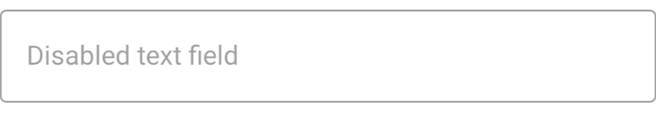
modifier를 설정하여 text field를 수정할 수 있는데 modifier에서 할 수 있는 모든 것을 수정할 수 있습니다.
여기 예제로는 fillMaxWidth()를 하여 app의 width를 꽉채운 것을 볼 수 있습니다.
enabled를 false로 처리하면 화면을 터치해도 아무 이벤트도 발생하지 않습니다. 클릭조차 되지 않게 됩니다.
- readOnly - 매개변수가 true이면 field의 텍스트에 초점을 맞출 수 있으며 사용자는 복사할 수 있지만 수정할 수는 없습니다.
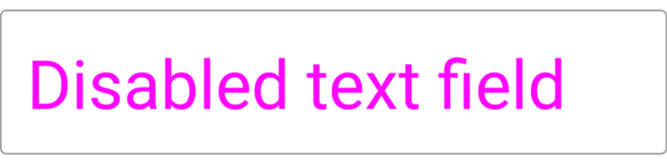
- textStyle - 입력 텍스트의 스타일. 이와 같이 쉽게 수정할 수 있습니다.
Surface(color = MaterialTheme.colors.background) {
    OutlinedTextField(value = "Disabled text field",
        onValueChange = { "abc" },
        modifier = Modifier.fillMaxWidth(),
        enabled = false,
        textStyle = TextStyle(fontSize = 40.sp,
            color = Color.Magenta))
}
- label - 컨테이너 내부 또는 컨테이너 상단에 포커스 상태일 때 표시할 레이블입니다. 아래와 같이 사용할 수 있습니다.
Surface(color = MaterialTheme.colors.background) {
    OutlinedTextField(value = "",
        onValueChange = { "abc" },
        modifier = Modifier.fillMaxWidth(),
        enabled = true,
        textStyle = TextStyle(fontSize = 40.sp,
            color = Color.Magenta),
        label = { Text(text = "Label for text") })
}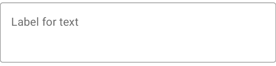
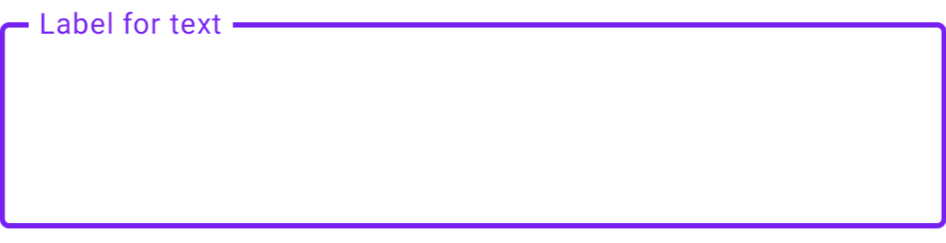
Label for text가 컨테이너 내부에 있다가 text 박스를 선택하면 오른쪽과 같이 "Label for text"가 컨테이너 상단에 표시되는 것을 볼 수 있습니다. (이때 value가 공백이어야 Label for text가 컨테이너 내부에 있게 됩니다)
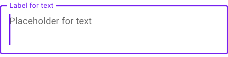
- placeholder - 필드가 비어 있을 때 표시할 자리 표시자
Surface(color = MaterialTheme.colors.background) {
    OutlinedTextField(value = "",
        onValueChange = { "abc" },
        modifier = Modifier.fillMaxWidth(),
        enabled = true,
        textStyle = TextStyle(fontSize = 40.sp,
            color = Color.Magenta),
        label = { Text(text = "Label for text") },
        placeholder = { Text(text = "Placeholder for text") })
}
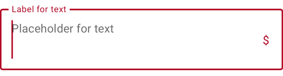
TextField를 선택하지 않았을 때는 Label for text가 출력되었다가 TextField를 선택하면 Placeholder for text가 내부에 표시되는 것을 확인할 수 있습니다. (placeholder는 필드가 비어 있을 때 표시할 자리 표시자, 여기서는 Text를 표시)

- leadingIcon - 필드 시작 부분에 표시되도록 구성 가능
Surface(color = MaterialTheme.colors.background) {
    OutlinedTextField(value = "",
        onValueChange = { "abc" },
        modifier = Modifier.fillMaxWidth(),
        enabled = true,
        textStyle = TextStyle(fontSize = 40.sp,
            color = Color.Magenta),
        label = { Text(text = "Label for text") },
        placeholder = { Text(text = "Placeholder for text") },
        leadingIcon = { Icon(imageVector = Icons.Default.Info, contentDescription = "") })
}
아래처럼 아이콘이 나오게하거나 Text가 나오게할 수도 있습니다.
leadingIcon = { Text(text = "$") }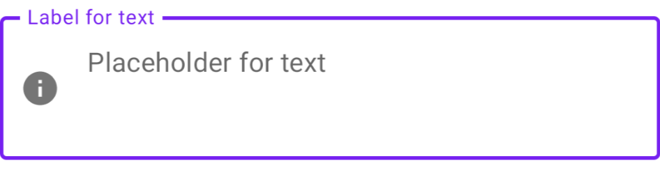
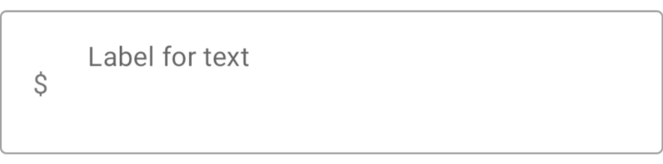
Text Field를 터치하던 안하던 leadingIcon은 그 위치를 지키고 있습니다.
- trailingIcon - 기본적으로 leadingIcon과 동일하지만 필드 끝에 생성됩니다.
- isError - 현재 텍스트 값이 오류 상태인지 여부를 나타냅니다. true로 설정하면 오류 레이블이 표시되고 trailingIcon이 오류 색상으로 표시됩니다. label과 trailingIcon이 지정되지 않은 경우 컨테이너만 오류 색상으로 변경됩니다.
Surface(color = MaterialTheme.colors.background) {
    OutlinedTextField(value = "",
        onValueChange = { "abc" },
        modifier = Modifier.fillMaxWidth(),
        enabled = true,
        textStyle = TextStyle(fontSize = 40.sp,
            color = Color.Magenta),
        label = { Text(text = "Label for text") },
        placeholder = { Text(text = "Placeholder for text") },
        trailingIcon = { Text(text = "$") })
}
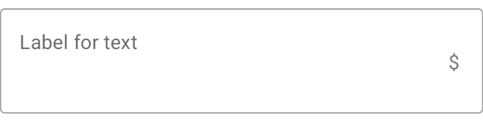
trailingIcon을 Text $로 설정한 후 아래와 같이 $가 오른쪽에 표시된 것을 볼 수 있습니다.
Surface(color = MaterialTheme.colors.background) {
    OutlinedTextField(value = "",
        onValueChange = { "abc" },
        modifier = Modifier.fillMaxWidth(),
        enabled = true,
        textStyle = TextStyle(fontSize = 40.sp,
            color = Color.Magenta),
        label = { Text(text = "Label for text") },
        placeholder = { Text(text = "Placeholder for text") },
        trailingIcon = { Text(text = "$") },
        isError = true)
}
isError = true로 설정 후 label과 trailingIcon 그리고 text field의 색이 변경된 것을 볼 수 있습니다.
- visualTransformation - 암호를 쓸 때 '*'를 표시하는 것과 같이 입력 값의 시각적 표현을 변환합니다. 이 사용 사례에는 PasswordVisualTransfermation이 있지만 직접 구현하는 것은 간단합니다.
Surface(color = MaterialTheme.colors.background) {
    OutlinedTextField(value = "developerJ",
        onValueChange = { "abc" },
        modifier = Modifier.fillMaxWidth(),
        enabled = true,
        textStyle = TextStyle(fontSize = 40.sp,
            color = Color.Magenta),
        visualTransformation = PasswordVisualTransformation(),
    )
}
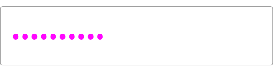
developerJ라고 값을 넣어줬는데 9글자가 전부 점으로 변경된 것을 볼 수 있습니다.
- keyboardOptions - KeyboardType, ImeAction등을 구성하는 데 사용되는 SW 키보드 옵션
keyboardOptions = KeyboardOptions.Default.copy(
    capitalization = KeyboardCapitalization.Words,
    autoCorrect = false,
    keyboardType = KeyboardType.Text,
    imeAction = ImeAction.Search
)[androidx.compose.foundation.text] class KeyboardOptions 정리
class KeyboardOptions TextFields에 대한 키보드 구성 옵션입니다. 소프트웨어 키보드가 여기에 제공된 옵션을 준수하는지 여부는 보장되지 않습니다. Summary Public companion properties KeyboardOptions Defa..
mypark.tistory.com
- keyboardActions - 입력 서비스가 작업을 내보내면 해당 콜백이 호출됩니다.
keyboardActions = KeyboardActions(
    onAny = {} // do when ANY of ime actions is emitted
)

//OR

keyboardActions = KeyboardActions(
    onDone = {}, // do when SPECIFIED action is emitted
    onSearch = {},
    .
    .
}[androidx.compose.foundation.text] class KeyboardActions 정리
class KeyboardActions KeyboardActions 클래스를 사용하면 개발자가 소프트웨어 키보드에서 IME 작업을 트리거하는 사용자에 대한 응답으로트리거될 작업을 지정할 수 있습니다. Summary Public companion proper..
mypark.tistory.com
- singleLine - 텍스트가 가로 스크롤로 한 줄에만 있어야 하는지 여부. singleLine이 true인 경우 maxLines 매개변수는 무시됩니다.
- maxLines - 최대 라인 수
- interactionSource - 이 컴포저블에 대한 상호작용 스트림을 나타내는 MutableInteractionSource입니다. Interactions를 관찰하고 컴포저블의 모양이나 동작을 사용자 정의하려는 경우 사용할 수 있습니다.
- shape - field 테두리의 모양
- colors - field 부분의 색상을 제어하는 TextFieldColors 객체의 인스턴스입니다. 아래와 같이 쉽게 변경할 수 있습니다.
Surface(color = MaterialTheme.colors.background) {
    OutlinedTextField(value = "developerJ",
        onValueChange = { "abc" },
        modifier = Modifier.fillMaxWidth(),
        enabled = true,
        textStyle = TextStyle(fontSize = 40.sp,
            color = Color.Magenta),
        leadingIcon = { Icon(imageVector = Icons.Default.Info, contentDescription = "") },
        colors = TextFieldDefaults.outlinedTextFieldColors(
            focusedBorderColor = Color.Yellow,
            leadingIconColor = Color.Yellow
        ))
}
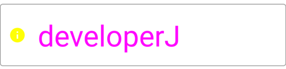
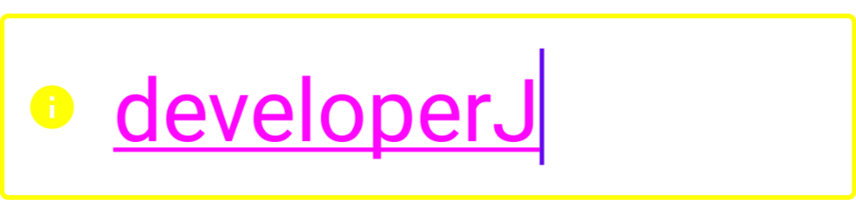
leadingIcon이 노란색으로 바뀌었고 선택이되어 focused가 되면 focusedBorder가 노란색으로 바뀌는 것을 볼 수 있습니다.
Filled text field in Jetpack Compose
Compose는 채워진 Text field의 Material 사양을 충족하기 위해 구성 가능한 TextField를 제공합니다.
추가 사용자 지정없이 TextField Composable은 다음과 같습니다.
Surface(color = MaterialTheme.colors.background) {
    TextField(value = "developerJ",
        onValueChange = { "abc" },
        modifier = Modifier.fillMaxWidth(),
        enabled = true,
        textStyle = TextStyle(fontSize = 40.sp,
            color = Color.Magenta),
        leadingIcon = { Icon(imageVector = Icons.Default.Info, contentDescription = "") },
        colors = TextFieldDefaults.outlinedTextFieldColors(
            focusedBorderColor = Color.Yellow,
            leadingIconColor = Color.Yellow
        ))
}
아래와 같이 아래 부분에 라인만 있고 위에는 라인이 없는 것을 확인할 수 있습니다.
TextField로 OutlinedTextField와 동일하게 작성해주면 됩니다.
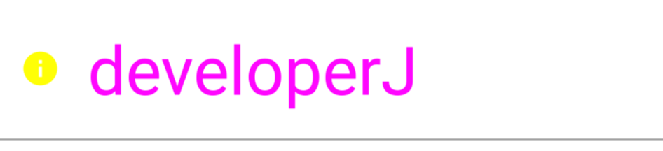
TextField Composable 함수의 모든 매개변수는 OutlinedTextField와 동일하며(다른 모양 및 색상 제외) 사용법이 동일합니다.
https://www.goodrequest.com/blog/jetpack-compose-basics-text-input
'Android > Jetpack Compose Concepts' 카테고리의 다른 글
| JETPACK COMPOSE Scaffold 정리 (0) | 2022.02.17 |
|---|---|
| Jetpack Compose 1.1 릴리즈! (0) | 2022.02.11 |
| JETPACK COMPOSE: Border에 대해 알아보자 (0) | 2022.01.23 |
| JETPACK COMPOSE: Jetpack Alpha for Glance Widgets (0) | 2022.01.21 |
| JETPACK COMPOSE: Column에 대해 알아보자 (0) | 2022.01.13 |


댓글