What's Jetpack?
A library of tools to help developers build modern Android apps following the best practices
Jetpack Libraries Types
The library is vast, but the main types are :
Graphics, UI, Navigation, Media, Lifecycle, Data, Security, Data, Performance/Test
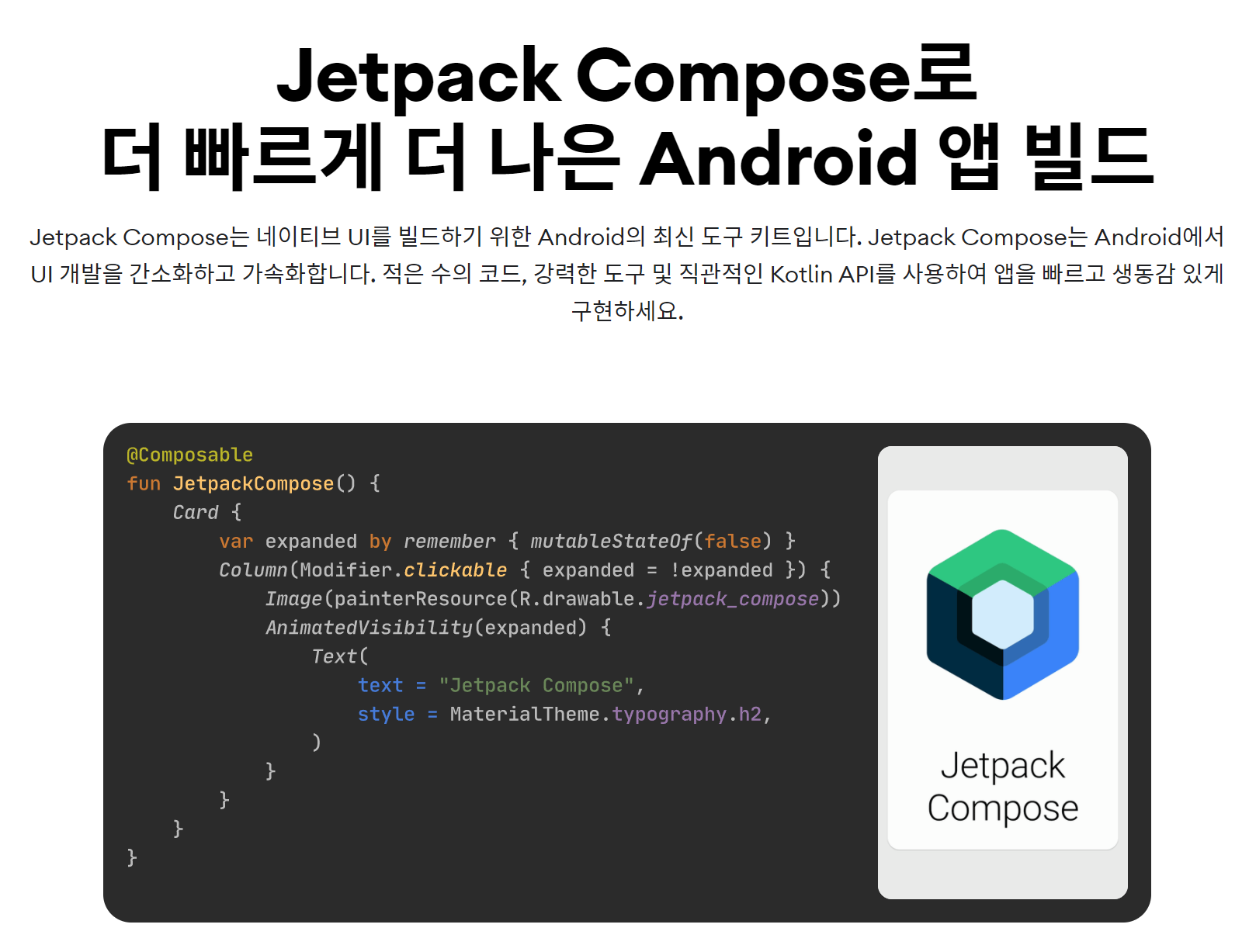
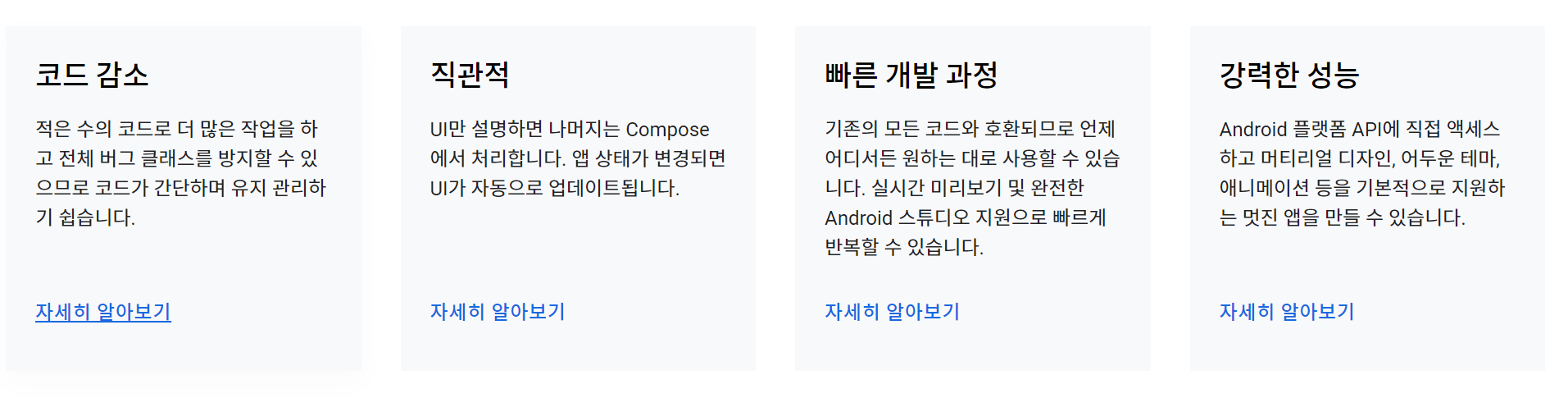
Jetpack Compose
Android's modern toolkit for building native UI(User interfaces)
Less code, Accelerated Development, Powerful tools, Kotlin APIs
Why JetPack Compose?
A huge shift in Android Developemnt - Declarative UI vs the Imperative approach
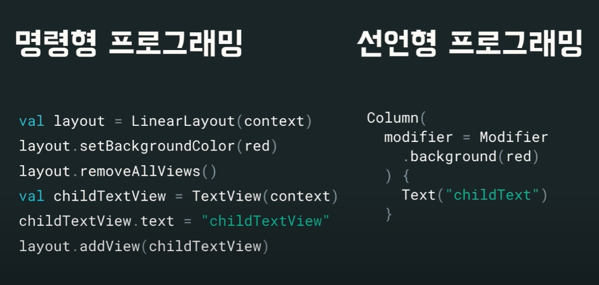
Imperative Approach - Android Developement
- Too complicated - a lot of moving parts.
- The UI is coupled with the logic and vice-versa (inflexible code)
- For example: to render a list with a few items, you'll need:
- RecyclerView
- Whic needs an Adapter
- Each list item needs a ViewHolder...
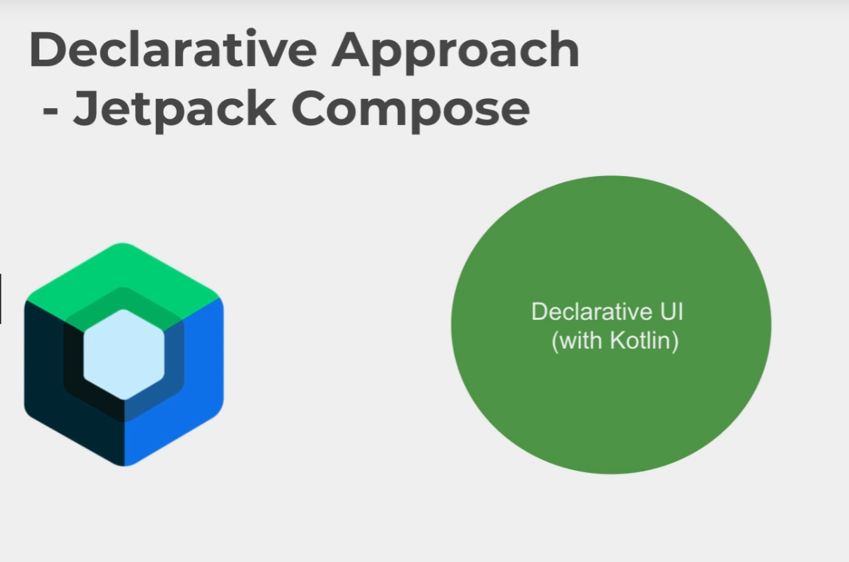
Declarative Approach - Jetpack Compose
- Simpe and efficient!
- No more boilerplate code!
- You declare/describe in code what you want to see, and not describing every step to get the result.
- For example: to render a list with a few items, you'll need:
- LazyColumn

Declarative UI Approach
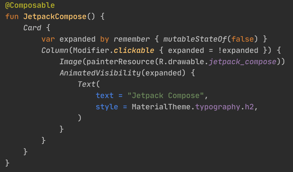
Jetpack Compose로 구성된 코드를 만들어 봅시다.
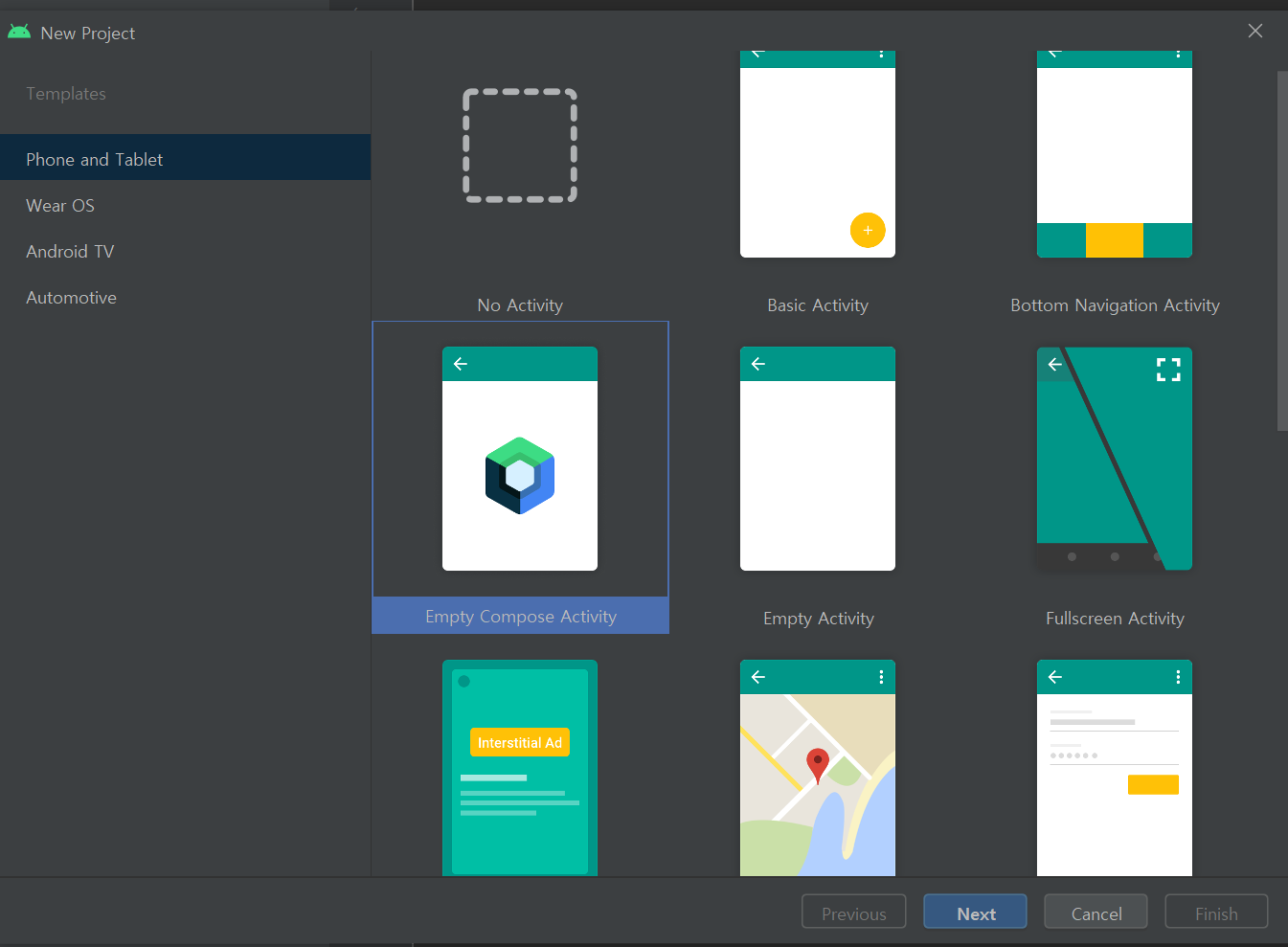
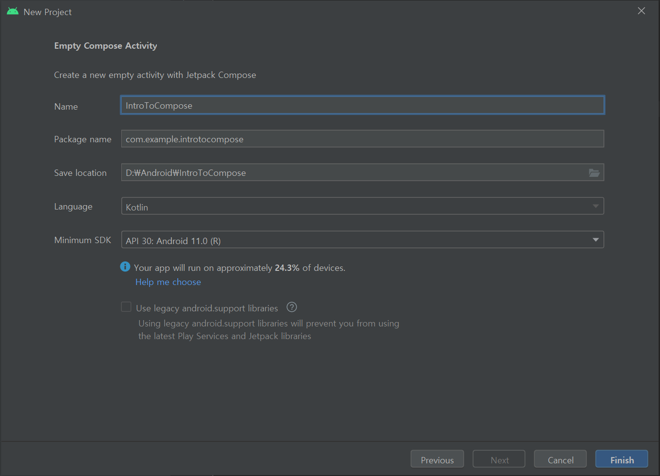
먼저 Empty Compose Activity를 만들어 줍니다.
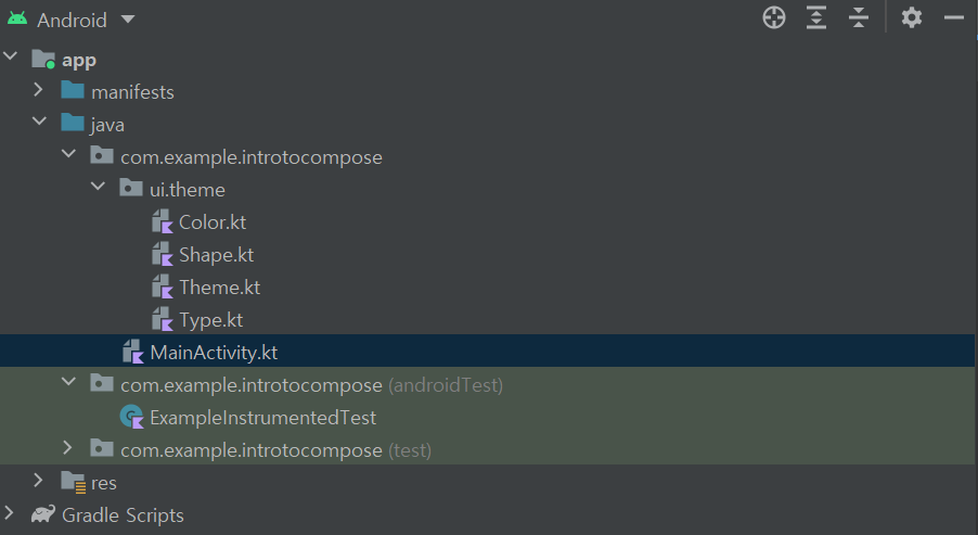
ui.theme 안에 Color.kt, Shape.kt, Theme.kt, Type.kt가 있고
com.example.introtocompose에 MainActivity.kt가 있는 것을 볼 수 있습니다.
package com.example.introtocompose

import android.os.Bundle
import androidx.activity.ComponentActivity
import androidx.activity.compose.setContent
import androidx.compose.material.MaterialTheme
import androidx.compose.material.Surface
import androidx.compose.material.Text
import androidx.compose.runtime.Composable
import androidx.compose.ui.tooling.preview.Preview
import com.example.introtocompose.ui.theme.IntroToComposeTheme

class MainActivity : ComponentActivity() {
    override fun onCreate(savedInstanceState: Bundle?) {
        super.onCreate(savedInstanceState)
        setContent {
            IntroToComposeTheme {
                // A surface container using the 'background' color from the theme
                Surface(color = MaterialTheme.colors.background) {
                    Greeting("Android")
                }
            }
        }
    }
}

@Composable
fun Greeting(name: String) {
    Text(text = "Hello $name!")
}

@Preview(showBackground = true)
@Composable
fun DefaultPreview() {
    IntroToComposeTheme {
        Greeting("Android")
    }
}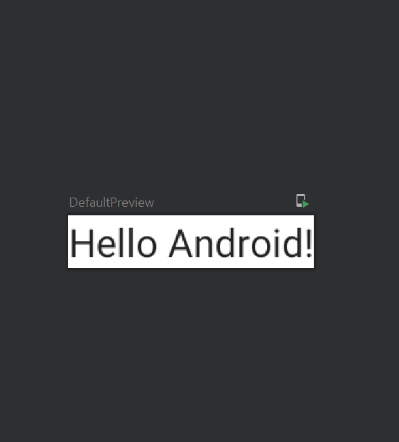
바로 DefaultPreview()가 Hello Android!를 그려주는 것을 알 수 있습니다.
fun DefaultPreview()위에 @Composable 주석이 있는 것을 볼 수 있습니다.
composable은 무조건 @Composable 주석을 작성 해야 이 함수가 데이터를 UI로 변환하기 위한 함수라는 것을 Compose compiler가 알 수 있습니다.
진짜로 저기에 preview를 뿌려주는 것은 @Preview 주석입니다.
Preview에 control을 누르고 클릭을하면 실제 구현을 볼 수 있습니다.
이것은 annotation class이고
@Repeatable
annotation class Preview(
    val name: String = "",
    val group: String = "",
    @IntRange(from = 1) val apiLevel: Int = -1,
    // TODO(mount): Make this Dp when they are inline classes
    val widthDp: Int = -1,
    // TODO(mount): Make this Dp when they are inline classes
    val heightDp: Int = -1,
    val locale: String = "",
    @FloatRange(from = 0.01) val fontScale: Float = 1f,
    val showSystemUi: Boolean = false,
    val showBackground: Boolean = false,
    val backgroundColor: Long = 0,
    @UiMode val uiMode: Int = 0,
    @Device val device: String = Devices.DEFAULT
)
Preview can be applied to @Composable methods with no parameters to show them in the Android Studio preview.
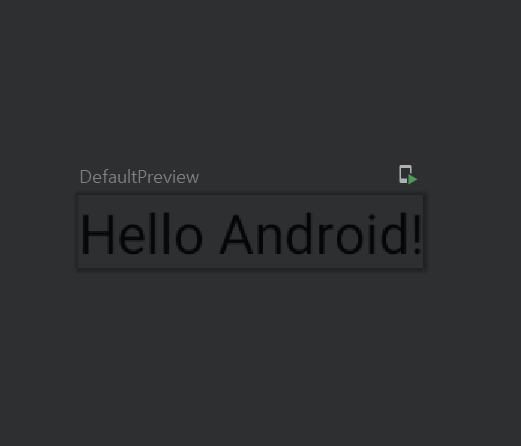
@Preview(showBackground = false)를 하게되면 아까 하얀색이던 배경이 사라지게 됩니다.
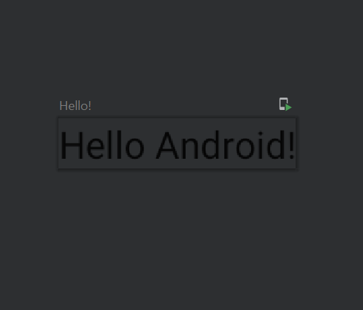
name에 "Hello!"를 넣으면 fun의 이름이었던 것이 "Hello!"로 바뀐 것을 볼 수 있습니다.
@Preview(name="Hello!", showBackground = false)
@Composable
fun DefaultPreview() {
    IntroToComposeTheme {
        Greeting("Android")
    }
}
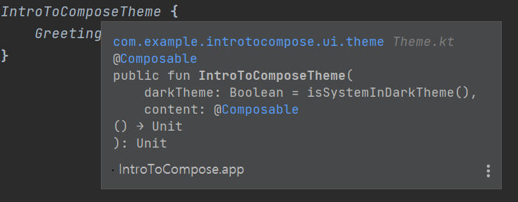
fun DefaultPreview() 아래 있는 IntroToComposeTheme을 눌러보면
실제 아까 ui.theme아래 있는 Theme.kt에 있는 @Composable 함수인 것을 알 수 있습니다.
package com.example.introtocompose.ui.theme

import androidx.compose.foundation.isSystemInDarkTheme
import androidx.compose.material.MaterialTheme
import androidx.compose.material.darkColors
import androidx.compose.material.lightColors
import androidx.compose.runtime.Composable

private val DarkColorPalette = darkColors(
    primary = Purple200,
    primaryVariant = Purple700,
    secondary = Teal200
)

private val LightColorPalette = lightColors(
    primary = Purple500,
    primaryVariant = Purple700,
    secondary = Teal200

    /* Other default colors to override
    background = Color.White,
    surface = Color.White,
    onPrimary = Color.White,
    onSecondary = Color.Black,
    onBackground = Color.Black,
    onSurface = Color.Black,
    */
)

@Composable
fun IntroToComposeTheme(
    darkTheme: Boolean = isSystemInDarkTheme(),
    content: @Composable() () -> Unit
) {
    val colors = if (darkTheme) {
        DarkColorPalette
    } else {
        LightColorPalette
    }

    MaterialTheme(
        colors = colors,
        typography = Typography,
        shapes = Shapes,
        content = content
    )
}
IntroToComposeTheme은 darkTheme과 content로 @Composable 함수를 받는 것을 알 수 있습니다.
여기서 content는 Greeting("Android")가 될 것입니다.
@Composable
fun Greeting(name: String) {
    Text(text = "Hello $name!")
}
Greeting은 @Composable 함수이고 만약에 @Composable을 제거하면 에러가 발생하는 것을 볼 수 있습니다.
그럼 새로운 @Composable 함수를 만들어 봅시다. age를 받아서 Text로 string을 넘기는 간단한 함수입니다.
@Composable
fun ShowAge(age: Int) {
    Text(text = age.toString())
}
여기에 Preview를 하기 위해 @Preview를 작성하였는데 아래와 같은 에러가 발생을 합니다.
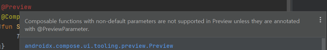
Composable functions with non-default parameters are not supported in Preview unless they are annotated with @PreviewParameter.
Default값이 없기 때문에 에러가 발생하는데요. Greeting 같은 경우 "Hello $name!"이라 name이 없어도 Hello !가 출력 되기 때문에 문제가 없는데 제가 만든 함수는 age가 없으면 문제가 발생합니다.
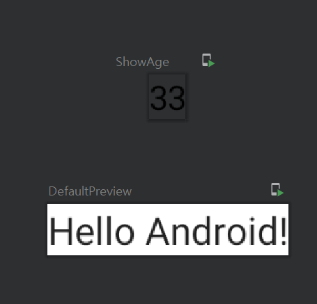
@Preview
@Composable
fun ShowAge(age: Int = 33) {
    Text(text = age.toString())
}
Default argument로 지정을 하여 이 문제를 해결합니다. 이제 아래와 같이 ShowAge 33과 DefaultPreview Hello Android!가 화면에 preview되는 것을 볼 수 있습니다.
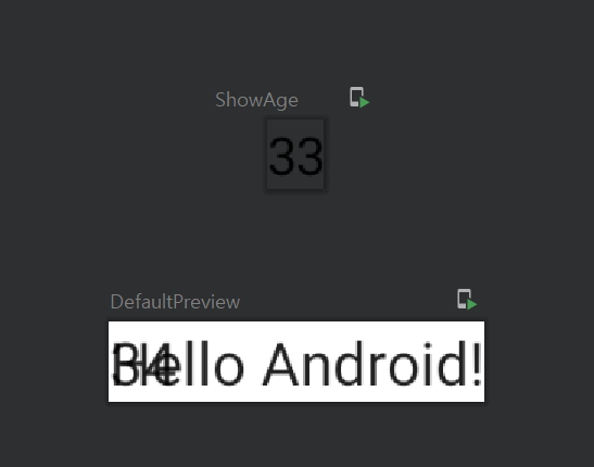
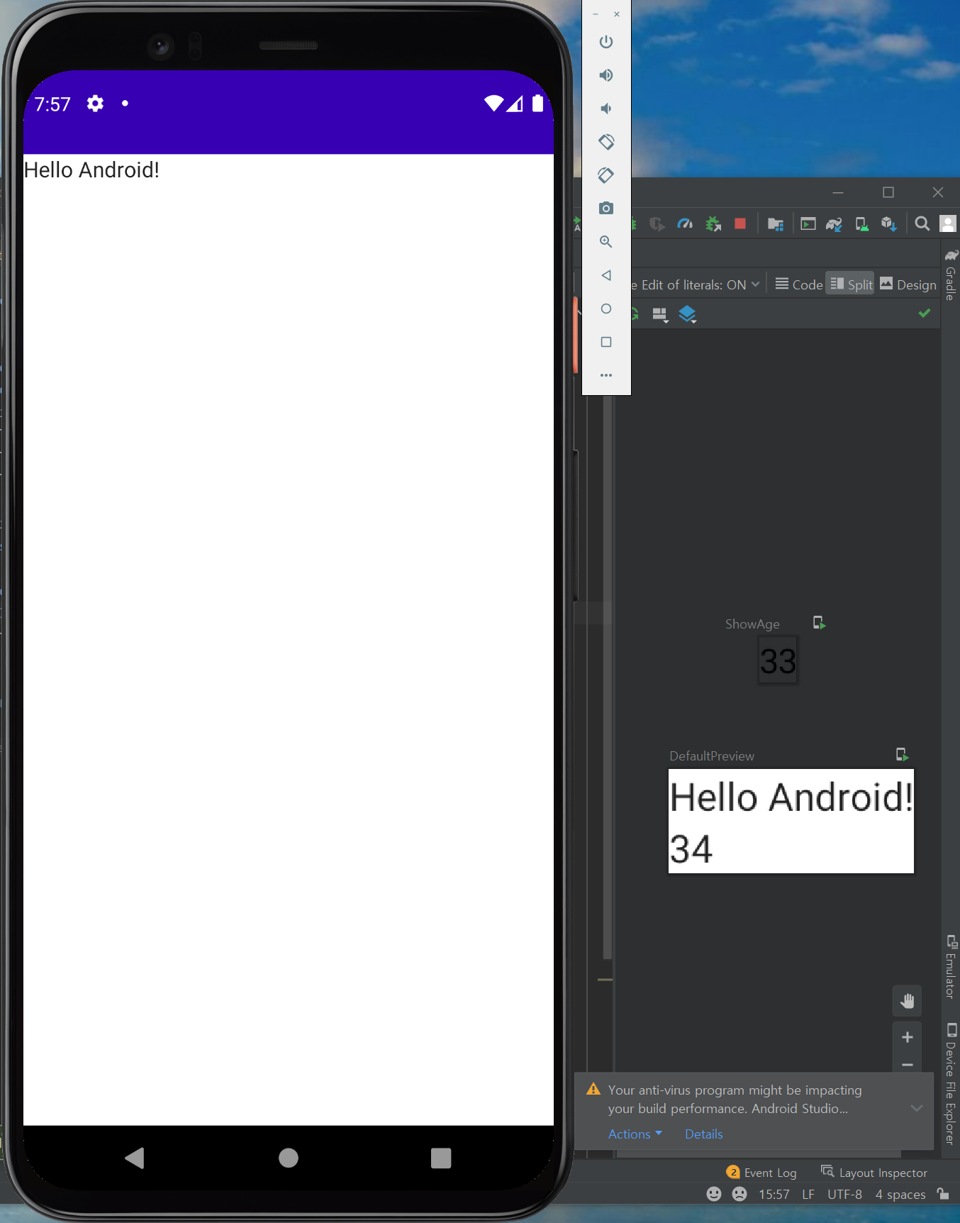
이제 IntroToComposeTheme안에 ShowAge(age = 34)를 추가해 보겠습니다.
@Preview(showBackground = true)
@Composable
fun DefaultPreview() {
    IntroToComposeTheme {
        Greeting("Android")
        ShowAge(age = 34)
    }
}
우리가 예상한 것은 ShowAge의 33이 34로 바뀌는 것인데 Hello Android! 쪽에 34가 출력되어 있는 것을 확인할 수 있습니다.
이제 Column()에 대해 배워보겠습니다. 일단 Column을 사용하기 위해 import를 해줍니다. (Android Studio에서 자동으로 import)
import androidx.compose.foundation.layout.ColumnA layout composable that places its children in a vertical sequence.
쉽게 말해 vertical sequence로 만들어주는 함수입니다.
@Preview(showBackground = true)
@Composable
fun DefaultPreview() {
    IntroToComposeTheme {
        Column() {
            Greeting("Android")
            ShowAge(age = 34)
        }
    }
}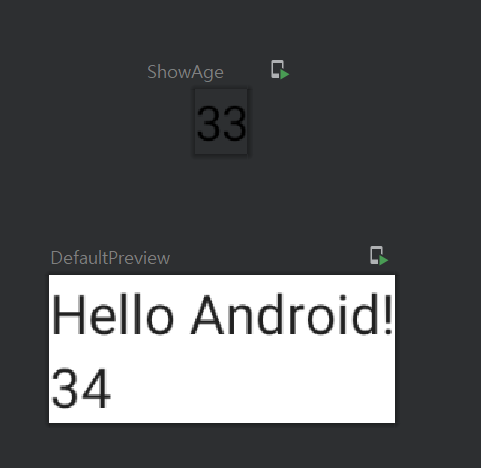
위와 같이 Hello Android! 밑에 vertical로 새로운 34가 생성되었습니다.
class MainActivity : ComponentActivity() {
    override fun onCreate(savedInstanceState: Bundle?) {
        super.onCreate(savedInstanceState)
        setContent {
            IntroToComposeTheme {
                // A surface container using the 'background' color from the theme
                Surface(color = MaterialTheme.colors.background) {
                    Greeting("Android")
                }
            }
        }
    }
}
이제 이 부분을 살펴보겠습니다. MainActivity라는 class가 있고 ComponentActivity()를 상속합니다.
이 것은 우리 프로젝트의 entry point입니다.
onCreate 함수를 override하고 super.onCreate(savedInstanceState)를 호출합니다.
SetContent에서 IntroToComposeTheme을 호출하고 이 안에는 Surface라는 것이 존재합니다.
SetContent :
Composes the given composable into the given activity. The content will become the root view of the given activity.
Surface : most basic canvas, Composable
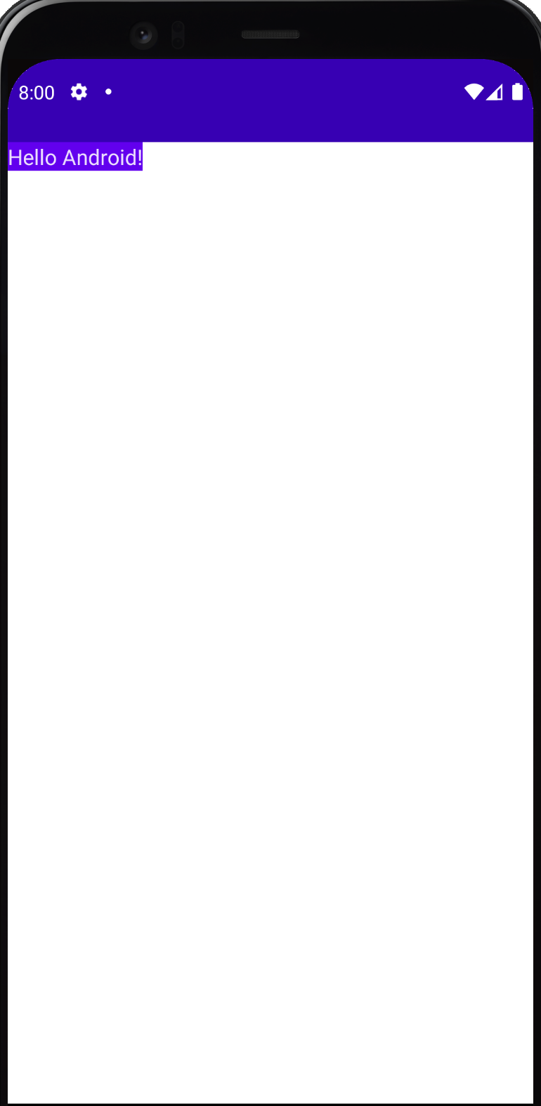
실제 Emulator에서 이 app을 실행하면 오른쪽과 같이 나오길 기대했는데 Hello Android!만 출력되 있는 것을 확인할 수 있습니다.
이 것은 결국 DefaultPreview()는 안드로이드 studio에서만 보이는 것이고 실제 app에서는 Surface 안에 있는 것만 출력 되는 것임을 알 수 있습니다.
만약 Surface의 color를 변경하면 어떻게 될까요?
class MainActivity : ComponentActivity() {
    override fun onCreate(savedInstanceState: Bundle?) {
        super.onCreate(savedInstanceState)
        setContent {
            IntroToComposeTheme {
                // A surface container using the 'background' color from the theme
                Surface(color = MaterialTheme.colors.primary) {
                    Greeting("Android")
                }
            }
        }
    }
}
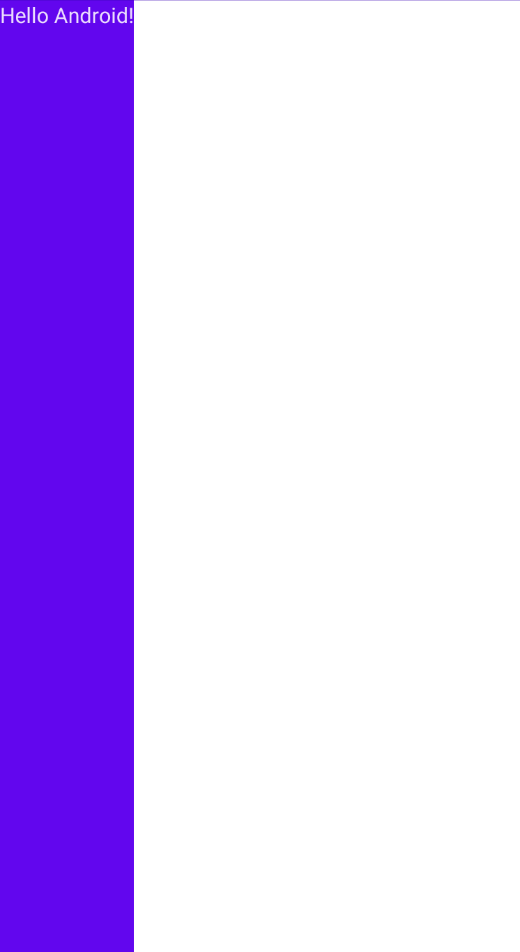
위와 같이 Text의 배경 색이 변경됨을 알 수 있습니다.
Surface 함수를 보면 modifier가 있는데 여기서 가장 중요한 인자 중 하나입니다.
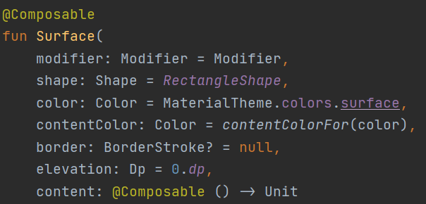
Modifier는 Compose의 UI component를 꾸미거나 행동을 추가하기 위한 요소들의 모음입니다.
Modifier로 할 수 있는게 무엇이 있는지 살펴봅시다.
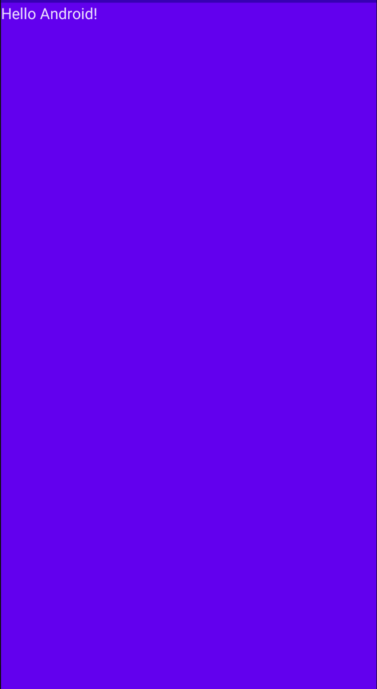
Surface안에 modifier = Modifier.fillMaxHeight()를 넣어봅시다.
                Surface(
                    modifier = Modifier.fillMaxHeight(),
                    color = MaterialTheme.colors.primary) {
                    Greeting("Android")
                }
아래와 같이 Text크기 만큼 세로로 화면을 보라색 배경이 다 채운 것을 확인할 수 있습니다.
여기에 더 뭔가를 추가하려면 어떻게 해야할까요?
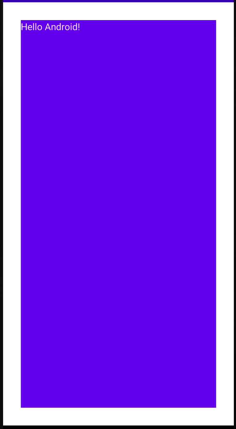
                Surface(
                    modifier = Modifier.fillMaxHeight()
                        .fillMaxWidth(),
                    color = MaterialTheme.colors.primary) {
                    Greeting("Android")
                }
그냥 바로 뒤에 .을 넣고 함수를 호출하면 됩니다. 여기서는 fillMaxWidth()를 추가로 호출하였습니다.
이제 모든 Surface가 보라색 배경으로 꽉찬 것을 볼 수 있습니다.
또 하나 넣어볼까요?
이번에는 padding입니다.
                Surface(
                    modifier = Modifier.fillMaxHeight()
                        .fillMaxWidth()
                        .padding(all = 30.dp),
                    color = MaterialTheme.colors.primary) {
                    Greeting("Android")
                }
.padding(all = 30.dp)를 추가했습니다. 여기서는 dp라는 크기단위를 사용하여 padding을 줍니다.
아래 보면 전체 Surface에서 30dp 정도의 간격에 빈 공간이 생기고 전체 공간이 꽉 찬 것을 볼 수 있습니다.
'Android > Jetpack Compose App' 카테고리의 다른 글
| JETPACK COMPOSE: 팁 계산기 만들기 - 2 (0) | 2022.02.08 |
|---|---|
| JETPACK COMPOSE: 팁 계산기 만들기 - 1 (0) | 2022.01.26 |
| JETPACK COMPOSE: 터치하면 돈이 올라가는 앱을 만들어보자 - 3 (0) | 2022.01.21 |
| JETPACK COMPOSE: 터치하면 돈이 올라가는 앱을 만들어보자 - 2 (0) | 2022.01.21 |
| JETPACK COMPOSE: 터치하면 돈이 올라가는 앱을 만들어보자 - 1 (0) | 2022.01.20 |


댓글